Understanding UX wireframes: Their role and importance in design.
Website wireframes are frequently underestimated, yet they are a crucial tool that offer far more than just simple mock-ups. The UX team at Ridgeway highlights both the advantages and disadvantages of wireframing, noting that it's often perceived in stark "black and white" terms.
Once, while presenting a set of wireframes to a client, I paused after reviewing a few pages to ask for feedback. The client's first comment was, "It's a bit black and white."
This puzzled me, as I had been meticulously refining the layout for days. It was then that I realised my oversight.
Wireframes are the key tool for planning out an experience where users are able to accomplish their goals with as little friction as possible.
A great deal of focus had been placed on presenting a polished wireframe, leading to the assumption that we were showcasing the final design of the website.
We had been presenting wireframes inappropriately, and it was evident that their purpose was misunderstood. This prompted me to re-evaluate the core objectives of what a wireframe should accomplish.
What are wireframes?
The simplest way to think of wireframes is as blueprint layouts that depict the structure of key webpages. They are an essential element of the interaction design process. Wireframes enable you to quickly validate and test ideas with stakeholders and users.
Why are wireframes useful?
Wireframes are utilised to map out user journeys, depict planned interactions, and facilitate discussions about strategies aligned with the project's initial objectives. They offer the project team valuable insights early in the project lifecycle, enabling them to learn and make decisions that align the goals with stakeholders' objectives and user feedback.
What are the different types of wireframes?
It's crucial to understand the terminology associated with wireframes to prevent misunderstandings and misconceptions. They can range from simple sketches to fully interactive page layouts that demonstrate functionality. Below, we explain the characteristics and expectations of each fidelity level in wireframing.
What are low fidelity wireframes?
Low fidelity wireframes provide a contextual overview of the elements that structure a page, including basic details. They can range from simple sketches to more formal annotated versions for presentations. These wireframes are useful for outlining functionality, content flow requirements, and interactions, which help define the scope of key features.
What are medium fidelity wireframes?
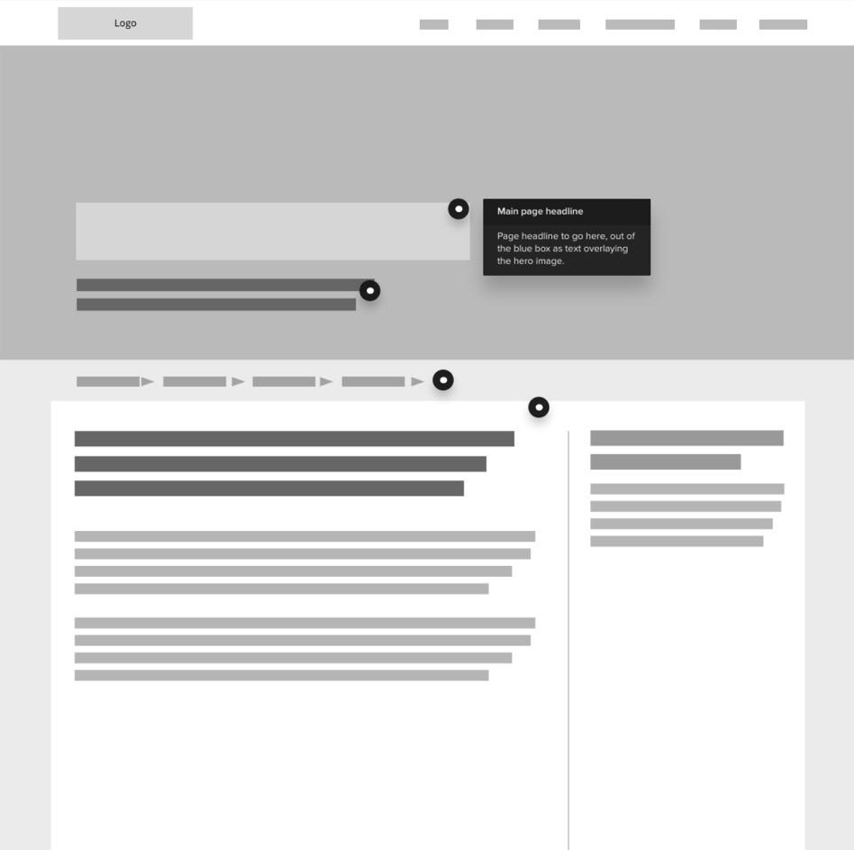
A medium fidelity wireframe delves into the core characteristics of a project. It includes placeholder content to set expectations for content needs and may explore micro copy to help establish the project's tone of voice. These wireframes often incorporate basic interactions to explore user journeys and facilitate discussions with stakeholders and users about the overall design approach.
Example wireframe (medium fidelity) with annotations:

Interactive wireframes rewrite the rules of functionality and design
Once the structure is established, an interactive wireframe can be created. This step is invaluable as it allows you to simulate user interactions with the elements, essentially putting yourself in the user's shoes. By evolving the wireframe into a functional prototype, you can identify and address any usability issues.
Demonstrating interactivity facilitates broader discussions about functionality and helps stakeholders and developers gain a clearer understanding of how a component or page will function. This clarity allows for more accurate estimates for both front-end and back-end development.
Interactive wireframes also provide a means to share findings with stakeholders and users, offering deeper insights into user behaviour and reactions to your solution.
How does Ridgeway use wireframing?
We start by using sketches to develop initial ideas for a project. This session involves collaboration between the UX Team and the Development Team.
The UX Team shares concepts based on the outcomes and objectives established during the discovery workshops with the client. These sketches give the Development Team a framework to start developing a functional specification.
The UX Team then uses these sketches to explore structure and interactions across devices, ultimately creating a set of interactive wireframes.
What are the best tools for wireframing and prototyping?
At this point we use Sketch to build layouts that provide us with a view of all the templates, components and widgets a page will require. These are created at a level of fidelity that will allow us to share, discuss and ultimately test with stakeholders and the project team.
Wireframes form a fundamental cog in a project’s lifecycle. We reference them at all stages of our projects as the best reflection of the functional discussions between the project teams and project stakeholders.
Making the most from wireframing
Wireframes are far more than just simple black and white designs, and it's important to clarify their purpose to avoid costly misunderstandings.
A wireframe should be adaptable and easy to update based on insights gained from discussions with the broader project team.
Focusing too much on the fine details in a wireframe can create problems, as wireframes are not intended to be visually polished but functional. They serve to clearly show where page content and functionality will be placed, providing designers and developers with essential information to advance the project.
A well-crafted wireframe is a collaborative tool that helps project teams and stakeholders engage in constructive discussions, ensuring that the project aligns with its objectives and goals.